Gridlight Developer Documentation
Everything you need to build, test, and publish apps on the Gridlight platform.
Getting Started
Gridlight apps are web applications that run inside the Gridlight desktop shell. They can be as simple as a single HTML file or as complex as a full-stack app with a backend server. The Gridlight platform gives your app instant access to local AI capabilities — LLMs, image generation, RAG, and memory — without any cloud dependencies.
Three ways to build apps:
- App Builder — A visual, no-code builder for creating apps by dragging and dropping components
- New Dev App — Scaffold a new app from templates directly inside Gridlight
- Manual — Write your app from scratch using HTML, CSS, and JavaScript
Architecture Overview
- Gridlight Desktop (Tauri) — The native shell that loads and displays your apps
- Gateway (Rust/Axum) — REST API on port 8080 that orchestrates all AI requests
- Agents — Specialized workers for inference, embeddings, reranking, and verification
- Your App — A web app (HTML/CSS/JS) rendered in a Tauri webview, calling the Gateway API
Apps don't need to bundle any AI models or ML libraries. They simply make HTTP calls to the local Gateway API, which handles all the heavy lifting.
Prerequisites
- Gridlight desktop app installed and running
- At least one AI model downloaded (for testing AI features)
# Check Node.js
node --version

# Check that Gridlight Gateway is running
curl http://localhost:8080/health
App Builder (No-Code)
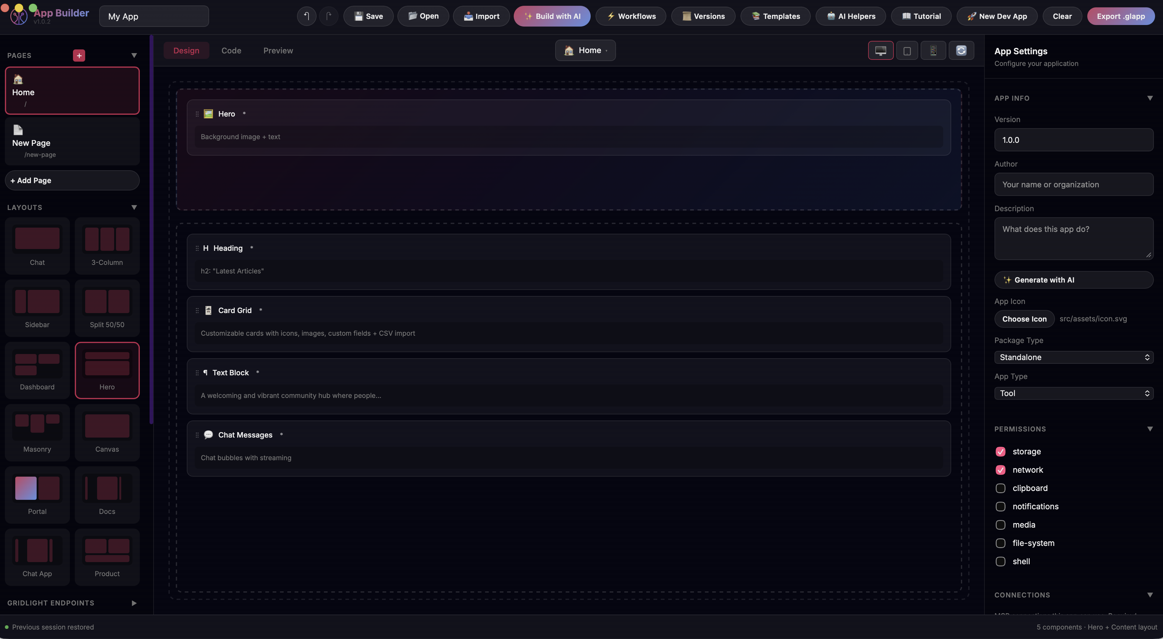
The fastest way to build a Gridlight app is with the visual App Builder. Open it in your browser, choose a layout, drag components onto the canvas, configure their properties, and export a ready-to-run app — no code required.
- Open App Builder — Launch App Builder from within Gridlight — find it in your apps library and click to open.
- Choose a layout — Pick a layout: Chat, Dashboard, Sidebar, Split, Full Canvas
- Add components — Browse the component panel on the left. Drag components into the canvas zones. There are 56+ components.
- Configure properties — Click any component to open its configuration panel on the right.
- Preview and export — Preview your app in real time, then export as HTML or
.glapppackage.
AI-Powered Building
Click "Build with AI" and describe what you want in plain language:
"Create a customer feedback form with a star rating, comment box, email field, and a submit button that saves responses to Gridlight."
Creating a New Dev App
Click "New Dev App" in the Apps tab to scaffold a project in seconds.
- Open the Apps tab
- Click "New Dev App" — give your app a name
- Choose a template — Default, Chat, or Dashboard
- Select a theme and layout — Theme: Gridlight, Midnight, Modern, Minimal. Layout: Chat, Dashboard, Sidebar, Split, Full Canvas
- Start building — Gridlight creates the project with
gridlight.json,app.json, and HTML entry point
Project structure:
├── gridlight.json # App manifest (name, version, entry point)
├── src/
│ ├── app.json # App configuration (layout, components, zones)
│ └── index.html # Entry point
└── README.md
Building Apps with Code
For maximum control, build from scratch. You need two files: gridlight.json and an HTML entry point.
{
  "name": "My Custom App",
  "version": "1.0.0",
  "short_description": "A custom AI-powered application",
  "detailed_description": "A full description of what this app does and its features.",
  "usage_instructions": "Describe how to use the app here.",
  "author": "Your Name",
  "icon": "src/assets/icon.png",
  "entry": "src/index.html",
  "runtime": "1.0",
  "type": "standalone",
  "gridlight_version_required": "0.6.0",
  "permissions": ["network", "storage"],
  "dependencies": {
    "components": [],
    "themes": []
  },
  "build": {
    "target": "single-html",
    "minify": true
  },
  "window": {
    "width": 1200,
    "height": 800
  }
}<!DOCTYPE html>
<html lang="en">
<head>
<meta charset="UTF-8">
<title>My Custom App</title>
<style>
body { font-family: system-ui; background: #0f0f23; color: #fff; }
</style>
</head>
<body>
<h1>Hello, Gridlight!</h1>
<button onclick="askAI()">Ask AI</button>
<div id="response"></div>
<script>
async function askAI() {
const res = await fetch('http://localhost:8080/neon', {
method: 'POST',
headers: {
'Content-Type': 'application/json',
'Authorization': 'Bearer dev-token'
},
body: JSON.stringify({
question: 'What is Gridlight?',
stream: false
})
});
const data = await res.json();
document.getElementById('response').textContent = data.answer;
}
</script>
</body>
</html>You can use any frontend framework — React, Vue, Svelte, or vanilla JS. As long as you have a gridlight.json and HTML entry point, Gridlight will load it.
Hybrid App Manifest
{
  "name": "My Hybrid App",
  "version": "1.0.0",
  "short_description": "An app with a backend server",
  "author": "Your Name",
  "icon": "frontend/assets/icon.png",
  "entry": "frontend/index.html",
  "runtime": "1.0",
  "type": "hybrid",
  "gridlight_version_required": "0.6.0",
  "backend": {
    "entry": "backend/server.js",
    "port": 3002,
    "install": "npm install",
    "healthCheck": "/api/health"
  },
  "permissions": ["network", "storage"],
  "dependencies": {
    "components": [],
    "themes": []
  },
  "build": {
    "target": "hybrid-app",
    "minify": true
  },
  "window": {
    "width": 1200,
    "height": 800
  }
}
Manifest Field Reference
| Field | Required | Type | Description |
|---|---|---|---|
name |
Yes | string | Display name shown in the app launcher and marketplace. Keep it short and descriptive. |
version |
Yes | string | Semantic version (e.g. "1.0.0"). Bump this each time you publish an update. |
short_description |
Yes* | string | 1-2 sentence summary displayed on the app card in the marketplace. Required for publishing. |
detailed_description |
No | string | Full description shown on the app details page. List features and capabilities here. |
usage_instructions |
No | string | Step-by-step instructions for using the app. Shown in the help/info panel. |
author |
Yes* | string | Author or organization name. Displayed on the app card. Required for publishing. |
icon |
Yes* | string | Relative path to the app icon (SVG or PNG). Used in the launcher and marketplace. Required for publishing. |
entry |
Yes | string | Relative path to the HTML entry point. For standalone apps use src/index.html, for hybrid apps use frontend/index.html. |
runtime |
Yes | string | Gridlight runtime version. Use "1.0" for all current apps. |
type |
Yes | string | "standalone" for frontend-only apps. "hybrid" for apps that include a backend server. |
gridlight_version_required |
No | string | Minimum Gridlight desktop version needed to run the app (e.g. "0.6.0"). Users on older versions will see an upgrade prompt. |
permissions |
No | array | System capabilities the app needs. Values: "network", "storage", "clipboard", "filesystem", "camera", "location", "notifications", "shell". |
dependencies |
No | object | Declares component, theme, and external library dependencies. Keys: components (array), themes (array), external (array of library names, e.g. "chart.js", "fflate@0.8.2"). |
build |
No | object | Build configuration. target: "single-html", "hybrid-app", "pwa", or "docker". minify: boolean to minify output. |
window |
No | object | Window size and behavior. Keys: width, height (pixels), minWidth, minHeight, maxWidth, maxHeight, resizable (boolean), maximized (boolean), fullscreen (boolean). |
backend |
Hybrid only | object | Backend server config. entry: JS file to run with Node. port (required): port to listen on. install: dependency install command. healthCheck: health endpoint path. |
connections |
No | array | MCP connections the app uses. Each entry has id ("filesystem", "fetch-web", "github") and required (boolean). |
Fields marked Yes* are technically optional for local development, but required when publishing to the Gridlight Marketplace. Fill them in before exporting your .glapp package.
Recommended Project Structure
Follow these conventions to keep your project clean and ready for marketplace publishing.
Standalone App
my-app/
├── gridlight.json          # App manifest
├── src/
│   ├── index.html          # Entry point
│   ├── app.json            # App config (settings, theme, layout)
│   ├── assets/
│   │   ├── icon.svg        # App icon (SVG recommended)
│   │   └── logo.png        # Logo or branding assets
│   ├── css/
│   │   └── styles.css      # Stylesheets
│   └── js/
│       └── app.js          # Application logic
├── scripts/
│   └── package-glapp.js    # Build script for .glapp export
├── dist/                       # Build output
│   └── my-app-1.0.0.glapp # Packaged app for marketplace
└── tests/ # Test files- Keep
gridlight.jsonat the project root — Gridlight looks for it there. - Use
src/for all source files to keep the root directory clean. - Use SVG for your app icon — it scales to any size in the marketplace and app launcher.
- Build output goes to
dist/. Your.glapppackage is generated there.
Hybrid App (with Backend)
my-hybrid-app/
├── gridlight.json          # App manifest (type: "hybrid")
├── frontend/
│   ├── index.html          # Frontend entry point
│   ├── assets/
│   │   └── icon.svg
│   ├── css/
│   │   └── theme.css
│   └── js/
│       └── app.js
├── backend/
│   ├── server.js           # Backend entry point (Express, etc.)
│   ├── package.json        # Backend dependencies
│   ├── routes/             # API route handlers
│   │   ├── health.js
│   │   └── api.js
│   ├── services/           # Business logic
│   │   └── myService.js
│   └── db/                 # Database files (if using SQLite)
│       ├── schema.sql
│       └── init.js
├── dist/                       # Build output
│   └── my-hybrid-app-1.0.0.glapp
└── tests/- Separate
frontend/andbackend/directories clearly. - Your backend
server.jsshould listen on the port specified ingridlight.json. - Always provide a health check endpoint (e.g.
/api/health) so Gridlight can verify the backend is running. - Put
package.jsonin the backend directory and set"install": "npm install"in the manifest so dependencies are installed automatically. - Use
routes/for API endpoints andservices/for business logic. - For SQLite databases, store files in
backend/db/.
Enabling Dragging App Window
For app developers building Gridlight marketplace apps, the only thing needed is to add data-tauri-drag-region to your header element:
<header class="header" data-tauri-drag-region>
    <span>My App Name</span>
    <button>Settings</button>  <!-- buttons still work normally -->
</header>
That's it. Gridlight automatically detects:
- Any element with
data-tauri-drag-regionattribute - Any
<header>element - Any element with class
header
So if your app already has a <header> tag or a .header class on your top bar, dragging works automatically with no changes.
Interactive children (buttons, inputs, links, selects) are automatically excluded from the drag behavior.
Component Library
Gridlight provides 56 modular UI components. Each has configurable properties, built-in styling, and JavaScript logic.
Endpoint Components (5)
| Component | Description | How to Use |
|---|---|---|
| Neon Query | Send RAG-powered queries to /neon with streaming |
type: "neon-query". Configure domain and limit. |
| Intelligent Chat | Multi-turn conversational AI via /chat/intelligent |
type: "intelligent-mode". Pair with Chat Messages. |
| Image Generation | Generate images from text, transform, or inpaint via /image |
type: "image-gen". Configure width, height, steps, cfg_scale. |
| File Upload | Upload documents for training via /training/upload |
type: "file-upload". Supports Excel. |
| Text Train | Send raw text for training via /training/text |
type: "train". Connect a textarea. |
Display Components (5)
| Component | Description | How to Use |
|---|---|---|
| Response Display | Renders AI responses with markdown, citations, copy button | type: "response-display". Includes thinking indicator. |
| Chat Messages | Conversation thread with streaming support | type: "chat-messages". Configure userBubbleColor. |
| Status Badge | Connection/system status pill | type: "status-badge". Auto-shows states. |
| List | Customizable list with CSV import | type: "list-component". |
| Card Grid | Grid of cards with images/icons | type: "card-grid". Configure columns, fields. |
Form Components (10)
| Component | Description | How to Use |
|---|---|---|
| Auto Textarea | Expanding text input | type: "auto-textarea". Configure min/maxHeight. |
| Input + Send | Text input with action button | type: "input-send". Configure placeholder, buttonText. |
| Dropdown | Select from options | type: "dropdown-select". Provide options as JSON. |
| Checkbox Group | Multi-select checkboxes | type: "checkbox-group". Configure columns. |
| Chip Buttons | Clickable tag buttons | type: "chip-buttons". Enable multiSelect. |
| Quick Actions | Preset prompt buttons | type: "quick-actions". Define buttons as JSON. |
| Search with Filters | Search + Gridlight integration | type: "search-filters". Configure domain, limit. |
| Login Form | Email/password with OAuth | type: "login-form". Enable showOAuth. |
| Signup Form | Registration with password rules | type: "signup-form". Configure password requirements. |
| Password Reset | Password reset form | type: "password-reset". |
AI-Powered Components (7)
| Component | Description | How to Use |
|---|---|---|
| AI Content Generator | Generate text with tone/style | type: "ai-content-generator". |
| AI Chat Widget | Floating chat bubble | type: "ai-chat-widget". |
| Smart Search | Semantic search with citations | type: "smart-search". |
| AI Summary Card | Auto-summarize documents | type: "ai-summary-card". |
| Document Q&A | Upload doc + ask questions | type: "document-qa". |
| AI Form Filler | Extract structured data from docs | type: "ai-form-filler". |
| AI Data Insights | Auto-analyze datasets with charts | type: "ai-data-insights". |
Data & Visualization (6)
| Component | Description | How to Use |
|---|---|---|
| Data Loader | Fetch structured data from Gridlight | type: "data-loader". Set variable_name. |
| Metric Card | Single metric with change indicator | type: "metric-card". Configure label, change_type. |
| Bar Chart | Interactive category comparison | type: "bar-chart". Set data_source, label_key, value_key. |
| Line Chart | Trend analysis over time | type: "line-chart". Same config as Bar Chart. |
| Pie Chart | Distribution visualization | type: "pie-chart". Colors assigned automatically. |
| Data Table | Sortable table | type: "data-table". Set data_source. |
Layout & Containers (4)
| Component | Description | How to Use |
|---|---|---|
| Tabs | Switchable tab panels | type: "tabs-component". Define tabs as JSON. |
| Accordion | Collapsible sections | type: "accordion-component". Set allowMultiple. |
| Modal | Popup dialog | type: "modal-dialog". Configure triggerText, title, size. |
| Grid Container | CSS Grid layout | type: "grid-container". Configure columns, rows, gap. |
App Manifest Specification
Every app needs a gridlight.json file at the project root.
Required Fields
| Field | Type | Description |
|---|---|---|
name |
string | Display name |
version |
string | Semantic version (e.g. "1.0.0") |
entry |
string | Path to HTML entry point |
runtime |
string | Gridlight runtime version (use "1.0") |
type |
string | "standalone" or "hybrid" |
Optional Fields
| Field | Type | Description |
|---|---|---|
short_description |
string | 1-2 sentence summary for the app card |
detailed_description |
string | Full description for the app details page |
usage_instructions |
string | How to use the app, shown in help/info panel |
author |
string | Author or organization name |
icon |
string | Path to app icon (SVG or PNG recommended) |
gridlight_version_required |
string | Minimum Gridlight version needed (e.g. "0.6.0") |
app_type |
string | Category: "tool", "viewer", "editor", or "dashboard" |
permissions |
array | Requested permissions (see Permissions below) |
dependencies |
object | Component, theme, and external library dependencies |
build |
object | Build configuration (target and minify) |
connections |
array | MCP connection declarations |
window |
object | Window size and behavior settings |
backend |
object | Backend server config (required for hybrid apps) |
Permissions
The permissions array declares what system capabilities your app needs.
| Permission | Description |
|---|---|
"network" | Make HTTP requests to external servers |
"storage" | Store data locally (IndexedDB / localStorage) |
"clipboard" | Read and write to the clipboard |
"filesystem" | Read/write local files (prompts the user for access) |
"camera" | Access camera or microphone |
"location" | Access geolocation |
"notifications" | Show system notifications |
"shell" | Execute system commands (prompts the user for access) |
Window Object
Controls the initial window size and behavior when the app launches.
| Field | Type | Default | Description |
|---|---|---|---|
width | number | 1500 | Initial width in pixels |
height | number | 875 | Initial height in pixels |
minWidth / minHeight | number | — | Minimum dimensions |
maxWidth / maxHeight | number | — | Maximum dimensions |
resizable | boolean | true | Allow the user to resize the window |
maximized | boolean | false | Start maximized (fills screen, keeps taskbar) |
fullscreen | boolean | false | Start in true fullscreen (hides taskbar) |
Priority: fullscreen > maximized > width/height. If maximized is true, explicit width/height are ignored.
Dependencies Object
"dependencies": {
  "components": [],
  "themes": ["gridlight"],
  "external": ["chart.js", "katex"]
}| Field | Type | Description |
|---|---|---|
components | array | Custom component names your app depends on |
themes | array | Theme names (e.g. "gridlight", "arcade") |
external | array | External libraries with optional versions (e.g. "fflate@0.8.2") |
Build Object
"build": {
  "target": "single-html",
  "minify": true
}| Field | Type | Description |
|---|---|---|
target | string | "single-html", "hybrid-app", "pwa", or "docker" |
minify | boolean | Whether to minify the build output |
Backend Object (Hybrid Apps)
Required when type is "hybrid". Configures the backend server that Gridlight starts alongside your frontend.
| Field | Type | Required | Description |
|---|---|---|---|
entry | string | * | JS file to run with Node (e.g. "backend/server.js") |
command | string | * | Shell command to start the backend (e.g. "npm start") |
path | string | No | Working directory for the command (relative to app root) |
port | number | Yes | Port the backend listens on |
install | string | No | Dependency install command (e.g. "npm install") |
healthCheck | string | No | Health check endpoint path (e.g. "/api/health") |
Provide either entry or command, not both. With entry, Gridlight runs node <entry> from the app root. With command, Gridlight runs it as a shell process from the path directory.
Connections Array
Declare MCP (Model Context Protocol) connections your app can use.
"connections": [
  { "id": "filesystem", "required": true },
  { "id": "fetch-web", "required": false },
  { "id": "github", "required": false }
]| Connection ID | Description |
|---|---|
filesystem | Read/write files on the local filesystem |
fetch-web | Make HTTP requests to external URLs |
github | GitHub API access (repos, issues, PRs) |
Data Binding & State
Connect components using data bindings in app.json:
{
  "bindings": [
    {
      "source": "search-input",
      "sourceProperty": "value",
      "target": "results-display",
      "targetProperty": "query"
    }
  ]
}
Runtime API
// Set a value
window.AppBindings.setValue('global.username', 'Jane');

// Get a value
const name = window.AppBindings.getValue('global.username');

// React to changes
window.AppBindings.onChange('global.username', (newValue) => {
  console.log('Username changed to:', newValue);
});
Workflows & Automation
| Triggers | Actions |
|---|---|
| Form Submitted | Show Notification |
| Button Clicked | Navigate to URL |
| Page Loaded | Set Value |
| Data Changed | Show/Hide Component |
| Component Value Changes | Call API / Save to Gridlight |
| Webhook Received | Run Custom Code (JavaScript) |
| Scheduled (Cron) | HTTP Request, If/Else, Loop, Wait/Delay |
Example Workflow
{
  "workflows": [
    {
      "name": "Submit Feedback",
      "trigger": { "type": "form_submitted", "source": "feedback-form" },
      "actions": [
        {
          "type": "api_call",
          "url": "http://localhost:8080/training/text",
          "method": "POST",
          "body": { "content": "{{feedback-form.value}}", "domain": "feedback" }
        },
        {
          "type": "show_notification",
          "message": "Thank you for your feedback!",
          "variant": "success"
        }
      ]
    }
  ]
}
Themes & Styling
| Theme | Style |
|---|---|
| Gridlight | Dark with pink/purple accents (default) |
| Midnight | Deep blue-black with cool tones |
| Modern | Clean, minimal dark theme |
| Minimal | Light theme with subtle colors |
| Neon | Vibrant neon colors on dark background |
| Ocean | Blue-green oceanic palette |
| Forest | Earthy green tones |
| Sunset | Warm orange and red gradient |
| Elegant | Sophisticated dark with gold accents |
| Rose | Soft pink and rose tones |
Custom Theme Configuration
{
  "theme": {
    "preset": "custom",
    "primary": "#e91e63",
    "secondary": "#2196f3",
    "background": "#0f0f23",
    "surface": "rgba(26, 26, 46, 0.8)",
    "text": "#ffffff",
    "textMuted": "#888888",
    "accent": "#a855f7",
    "fontFamily": "Inter",
    "customFontUrl": "https://fonts.googleapis.com/css2?family=Inter:wght@400;500;600;700"
  }
}
Export & Publishing
HTML Export
Single HTML file — everything bundled. Perfect for quick sharing and testing.
.glapp Package
Native Gridlight package format:
npm run build      # Compile your app
npm run package    # Create .glapp file
Contains manifest, compiled app, and runtime. Users install by placing in ~/Gridlight/apps/.
PWA Export
Progressive Web App with manifest and service worker.
Publishing to Marketplace
- Build your .glapp package
- Visit market.gridlight.ai, create an account, and submit your app
- Set pricing — free or paid via Stripe, bundle discounts
- Submit for review — once approved, it's live
Include clear usage instructions and screenshots. Apps with good documentation get significantly more downloads.
API Reference
All requests go to http://localhost:8080. Requires Authorization: Bearer <token> header.
If building with App Builder, you don't need these APIs directly — components handle API communication automatically.
Default dev token is "dev-token". Change in production via Settings tab.
RAG / Knowledge Query
POST /neon — combines vector search, keyword retrieval, entity recognition, reranking, and LLM generation.
{
  "question": "What is our vacation policy?",
  "domain": "HR",
  "stream": true,
  "limit": 10,
  "access_tier": "internal",
  "include_sources": true,
  "max_tokens": 4096
}
With stream: true, responses come as SSE:
data: {"token": "Our"}
data: {"token": " vacation"}
data: {"token": " policy"}
data: [DONE]
Intelligent Chat
POST /chat/intelligent
{
  "message": "Explain how embeddings work",
  "conversation_id": "conv-123",
  "history": [
    { "role": "user", "content": "What is RAG?" },
    { "role": "assistant", "content": "RAG stands for..." }
  ]
}
Image Generation
POST /image
{
  "prompt": "A cyberpunk cityscape at sunset, neon lights",
  "negative_prompt": "blurry, low quality",
  "width": 1024,
  "height": 1024,
  "steps": 30,
  "cfg_scale": 7.5,
  "seed": -1
}
Memory
POST /remember
{
  "content": "User prefers Python code examples",
  "memory_type": "preference",
  "expiration": "never"
}
GET /memories response:
{
  "memories": [
    {
      "id": "mem-1",
      "content": "User prefers Python code examples",
      "type": "preference",
      "created_at": "2026-01-15T10:30:00Z"
    }
  ]
}
File Upload
POST /training/upload (multipart/form-data)
Supported formats: .pdf, .docx, .txt, .md, .csv, .xlsx, .json, .xml, .py, .js, .ts, .rs, .go, .java
Response:
{
  "status": "success",
  "chunks": 42,
  "message": "Document indexed successfully"
}
Best Practices
Streaming Responses
Always use streaming. It has the biggest impact on perceived performance.
const response = await fetch(`${gatewayUrl}/api/chat`, {
  method: 'POST',
  headers: { 'Authorization': `Bearer ${apiToken}` },
  body: JSON.stringify({ question, stream: true })
});

const reader = response.body.getReader();
const decoder = new TextDecoder();

while (true) {
  const { done, value } = await reader.read();
  if (done) break;

  const chunk = decoder.decode(value);
  for (const line of chunk.split('\n')) {
    if (line.startsWith('data: ')) {
      const data = JSON.parse(line.slice(6));
      appendToMessage(data.content);
    }
  }
}Support multiple SSE field names (delta, content, text, chunk) for forward compatibility.
Efficient DOM Updates
- Batch updates with
requestAnimationFrame - Update only the streaming message
- Cache completed markdown
let pendingTokens = '';
let rafId = null;

function onToken(token) {
  pendingTokens += token;
  if (!rafId) {
    rafId = requestAnimationFrame(() => {
      messageEl.textContent += pendingTokens;
      pendingTokens = '';
      rafId = null;
    });
  }
}
Caching & Pre-fetching
| Data Type | Suggested TTL | Invalidation |
|---|---|---|
| File contents | 30 seconds | On file change |
| Processed context chunks | 1 minute | On source file change |
| Workspace/project structure | 2 minutes | On file create/delete |
| Indexes and symbol tables | 24 hours | On staleness check |
Speculatively pre-fetch context for the next step — can reduce end-to-end time by 30–50%.
Error Handling & Retries
- Exponential backoff with jitter
- Categorize errors (retryable: network, 429, 5xx; not retryable: 401/403, 400)
- Cap at 3 retries, 30s max delay
- Don't retry streaming requests
async function fetchWithRetry(url, options, maxRetries = 3) {
  for (let attempt = 0; attempt <= maxRetries; attempt++) {
    try {
      const response = await fetch(url, options);
      if (response.ok) return response;
      if (response.status >= 400 && response.status < 500) throw response;
      if (attempt < maxRetries) {
        const delay = Math.min(1000 * Math.pow(2, attempt), 30000);
        const jitter = delay * (0.9 + Math.random() * 0.2);
        await new Promise(r => setTimeout(r, jitter));
      }
    } catch (err) {
      if (attempt === maxRetries) throw err;
    }
  }
}
Resource-Aware Design
- Check TFLOP allocation and adjust batch sizes
- Scale batch operations dynamically based on CPU cores
- Debounce file watchers by 2 seconds
- Bound caches (50 files max, 10MB max, LRU eviction)
UX Patterns
- Show placeholder messages immediately
- Provide a stop button (
AbortController) - Use fast-path checks before expensive operations
- Parallelize read-only operations with
Promise.all() - Handle large inputs by splitting into conversation history chunks (~9K chars)
Always give the user something to look at while the AI works. Instant visual feedback — even a loading state — makes everything feel twice as fast.